By default, when the Actions panel opens for a selected content item in the Content Manager, the Metadata panel is open. The Metadata panel houses information about the content item in a vertical pane. You use this panel to find out basic details about your content item and to make use of quick functions.
Metadata Panel
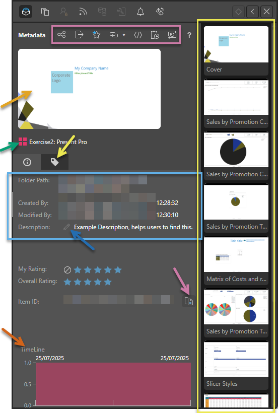
The metadata panel contains metadata relating to the content item that you selected in the CMS. Note that its appearance differs slightly for each of the app types. This example is of a presentation, hence the Present icon (green arrow) and the Slides sidebar to the right of the panel (yellow box):
Opening the Metadata panel
The Metadata panel is the default view in the Actions panel. You can open it by selecting the Metadata icon or Actions context menu for a content item that is selected in the CMS. For more information, see Actions Panel for Pros.
Quick Functions
These functions (purple box) allow users to perform some actions on their selected content item. The functions include some or, in the case of discoveries, all of the following:
- Print: Opens the Print & Export dialog. You can print and export your content to formats like PDF, Excel, and so on. For more information, see Print and Export across the system.
- Share: Opens the Share Content dialog. You can share your artifact with other users (recipients), either by attaching the exported content to an email or by sending a Share Link to the recipient for access in Pyramid. For more information, see Share Content.
- Export: Export content items as PIE files. For more information, see Import and Export.
- Favorites: Add to / Remove from Favorites. Favorites is a flat list of up to 20 items (content items and folders) that have been flagged as favorites by the current user. For more information, see Favorites for Pros.
- Direct URL Link: Copy a Direct URL Link to your Clipboard. For more information, see Copy Direct URL Links.
- OData Feed: Copy an OData Feed URL to your Clipboard. For more information, see OData Feed for Pros.
- Embed Code: Open the Embed Snippet generator. For more information, see Embed Snippet Generator.
- Audit Trail: View the Audit Trail for the content item. For more information, see Audit Trail (CMS).
Refresh Snapshots
Redraw the snapshot thumbnail for the selected content item. The new snapshot uses the content item's latest design and layout as its preview (called a thumbnail snapshot) in the metadata panel. The Refresh Snapshot function uses the Camera icon and is only available where the content item is from Discover, Illustrate, Tabulate, Present, and Publish. Click the icon to regenerate the snapshots; this may take several minutes.
- For more information about refreshing snapshots in Present, see Refresh Snapshots in Present Pro
- For more information about refreshing snapshots in Publish, see Refresh Snapshots in Publish Pro.
Snapshot
The snapshot (orange arrow) is displayed when a content item is viewed in the Content Manager. It works as a preview for users navigating the content items, typically showing the cover or first page of the content item to give the user a quick impression of its content.
Information pane
The information pane is shown by default and contains metadata about the item:
- The content item's name and type (green arrow).
- The content item's basic metadata (blue box), including its:
- Folder location.
- Creation details (by whom and when).
- Last Modification details (by whom and when).
- Description as set when saved or changed. This also includes an option to edit the description (blue arrow).
- Ratings: This panel lets users rate a content item and see the overall rating for the content from all users. (See User Recommended content.)
- Item ID: The unique identifier for the content item. This ID can be copied (purple arrow) for use in embedding, jump actions, admin diagnostics, and so on.
Query timeline
The Query timeline (brown arrow) charts an overview of usage over time. It is only shown for Discover, Present, Publish, and Tabulate content:
- In Discover, the timeline shows the query being run over time.
- In Present, Publish, and Tabulate, the timeline shows discoveries being incorporated and then run over time. This includes at presentation runtime and when the publication is built.
Where the presentation, publication, or tabulation (spreadsheet) does not incorporate a discovery, then No Usage Data is displayed in place of the timeline. Note that Tabulate only "incorporates" a discovery where there is a Direct (ongoing) connection between the discovery and the tabulation.
Tagging pane
The Tagging tab (yellow arrow) lets the user access the Tag Manager for the content item; where they can add, edit, or remove associated tags as needed.
Slides Sidebar
For Present items, the side bar is shown with all the thumbnails of the slides in the Present dashboard (yellow box). Clicking a specific slide in this panel opens the Present file for editing at that slide.